ESU Begins New Semester with New Brand Identity
Posted by: Elizabeth Richardson on January 17, 2017, One Comment
East Stroudsburg University of Pennsylvania President Marcia G. Welsh, Ph.D., revealed a new brand identity – including two new logos ‑ as part of a three-year marketing and branding initiative for the University during a reception on Tuesday, January 17.
Plans for a “new” ESU began back in September 2015 when the University hired Joe Bosack and Co. to compile research, test markets and develop a marketing plan and brand platform that are intended to raise awareness about the institution as well as support admission and enrollment initiatives.
“We always knew that ESU is positioned for greatness – not only in our location but most especially for the solid academic and life-long learning experiences we offer,” said President Welsh. “But we also knew that we did not have a cohesive brand message that would help us to broaden our recognition in a crowded market nor sufficiently support our endeavors to recruit students effectively.”
With set objectives to develop a bold visual identity that is aligned with the University’s mission, vision and strategic plan, ESU’s Office of University Relations began its work with Joe Bosack and Co. to identify and study perceptions of key stakeholders including current students, prospective students, alumni, donors, faculty and staff to get a sense of where to start.
“It wasn’t long after we began conducting focus groups and interviews that we discovered that, to our surprise, many constituents were not familiar with nor connected with ESU’s logos. That’s when it became apparent that it was time to develop a new identity for the University, one that would unify ESU across colleges, departments, organizations and affiliations,” said Brenda Friday, director of University Relations.
Friday added that the work to get to a new identity for ESU was a process that included the involvement of a CORE team of individuals representing enrollment management, administration, web services, athletics and advancement. Throughout the process, there were also multiple open meetings for students, faculty and staff to attend in order to provide their input. Presentations were also made to members of the University Alumni Association Board of Directors as well as the community-at-large.
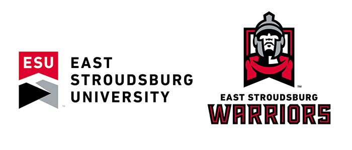
According to Friday, the new institutional and athletic marks complement one another in shape, using similar typography and a common color palette which is intentional for a cohesive University brand.
Institutional Logo
The new institutional logo is a bold, updated version of the previous logo, intended to transcend the University’s proud history and traditions and signify a current relevance to our region. With the addition of a new color, ESU’s official palette is now red, black and silver complemented with white, and the design is reflective of the outstanding campus community of students, faculty and staff, alumni and friends. The banner shape, similar to that of banners displayed during commencement ceremonies, signifies ESU as a leader in education. The new mark is aligned with the University’s guiding principles; to remain a challenging, contemporary and scholarly community that is unique, innovative and deeply embedded in the Pocono Mountains.
The previous logo was first used in 1993 to mark the centennial of ESU’s founding. The new logo enables the university to refresh the brand presentation to function significantly better across all digital media platforms while also aligning much better with what ESU is today and what ESU aspires to be tomorrow.
Athletics Logo
The new institutional logo aligns with the new athletic logo in shape, color and typography. In the past, the two logos had little in common.
ESU athletic teams have been identified as the Warriors since 1932. In the two decades since retiring all Native American imagery in compliance with NCAA requirements, the ESU Warriors have had a limited visual identity.
ESU’s new athletic mark gives the Warriors an identity that is confident, bold and eager to champion the University. Multiple versions of the marks will be available for merchandise across ESU’s color palette (black, red, silver), giving Warriors fans plenty of options to support their favorite student-athletes and teams.
ESU’s CORE team made recommendations based on data that was provided by the Pottsville-based firm Joe Bosack and Co., the selected vendor for this work. Joe Bosack & Co., has developed brand identities for nearly 100 colleges and universities across the country. Bosack and team also worked with the NCAA to redesign the association’s championship logos, including the identity for the Final Four.
More information about the new logo and frequently asked questions about the brand can be found at esu.edu/new-brand.
The Big Reveal
To support ESU’s new identity, a new mascot will be revealed at an event on Tuesday, January 24 at 7 p.m. in Koehler Fieldhouse that is open to the campus and local community members at no cost. The event will also feature nearly 300 members of the campus community with performances by the ESU Marching Band, Step Team, Dance Team, Musical Theatre Organization, Vocal Variations (ESU’s acapella group) and more! For further information on ESU’s new brand identity, contact Friday at (570) 422-3455 or at bfriday@esu.edu.


Kathleen Adams
Posted January 17, 2017 at 6:53 PM
As a member of the ESU community for more than 30 years, this is an exciting chapter in the midst of ESU taking ‘us’ all into ‘our’ future; proud, redefined, bigger, bolder, embracing, reaching beyond now, – the chrysalis opens and that which emerges soars!
Go WARRIORS!!